 I just completed typing answers to a whole bunch of questions in Blackboard Learn a few days ago. Believe me, the entire experience was an ordeal. I like the idea of giving students a dashboard where they can track their learning, but Blackboard is definitely not it! I first got introduced to Blackboard Learn in Managerial Dynamics over a year ago. Dr. Lydia King spent an hour going through the tool and getting people acquainted. Many days later we were still struggling, asking questions among ourselves and Googling. It wasn't the easiest tool to use. It defied all rules of usability! It's messy, cluttered, and grossly anti-user. I wonder what the developers were thinking when they created it. And how much do they charge for this terrible thing? Even their site cannot tell you easily. Perhaps you have to call or talk to their sales reps and ask. Amazing, right? For those of you who are not familiar, Blackboard Learn is a learning management system developed in 1997 by Americans Stephen Gilfus and Dan Cane. The tool itself is now widely used by many universities around the world incluing Ateneo GSB. There's a whole Wiki post about Blackboard here in case you're curious. If you're thinking of getting Blackboard as a tool for students in the future, you might wanna think twice. Blackboard sucks, and here's why:
It is evident that the designers of Blackboard are not yet aware of Web 2.0 or the existence of people like Jakob Nielsen. Given its current condition, it'll take a while for this tool to adapt to modern times. You can check how it looks like through the image below. (This is a screenshot of my own dashboard. I covered the school's logo and the courses am taking as this post is not really about them. ) 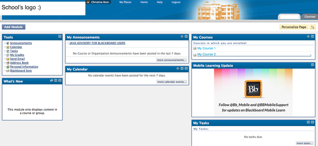 I still have a few more rants about Blackboard. I'll write more soon.
|
AUTHOR

I'm passionate about business, art, and technology. For more about me, click here.
BOOK PROJECT
Here's a book I co-wrote with a bunch of industry colleagues. Not sure if you'll find it useful, but feel free to check once you can. 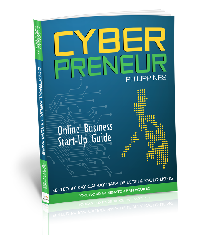
OTHER SITES
Personal
Tortured squid Hobbies & other stuff Work LegalMatch Philippines Artcebu Others Ateneo Graduate School of Business University of San Carlos Archives
October 2020
|